
Notebook / 02 — Research OS
A machine for finding the question
Most research tooling helps you test a hypothesis. Almost none of it helps you find one worth testing. This is an attempt at the second thing, pointed at India from orbit, and then pointed at itself.
Hour zero: one pixel, three formulas
Before any data was pulled, one tile over Delhi was read and three de-quantisation formulas were tested against it. The obvious one, linear, produces vectors with a norm of about 2.5. The square law produces 1.0001, which is what a unit-sphere embedding is supposed to give.
The discipline arrived before the data did. Had we scaled first and checked later, every number downstream would have been wrong and plausible.
The national pull
Eleven thousand seven hundred and forty-nine tiles, nine years, fifty-one minutes. Read directly from cloud storage rather than downloaded, and sampled from the overview pyramid rather than at full resolution: nineteen terabytes of source becomes 242 megabytes by choosing the right level.
Resolution is a decision, not a constraint. Most of the cost of a large dataset is spent before anyone asks how much detail the question needs.
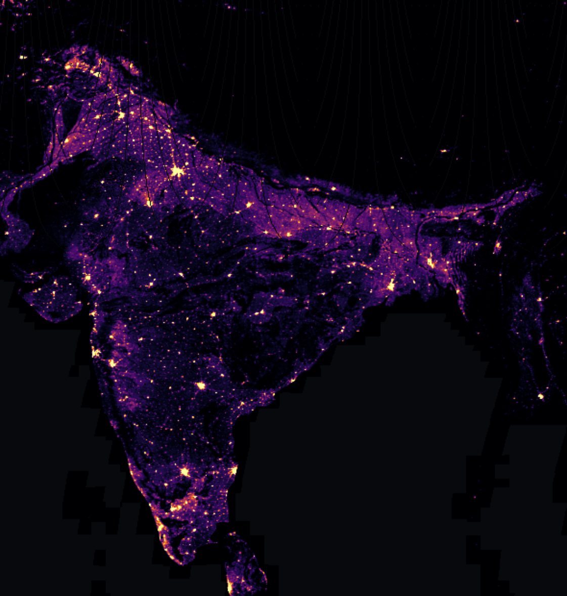
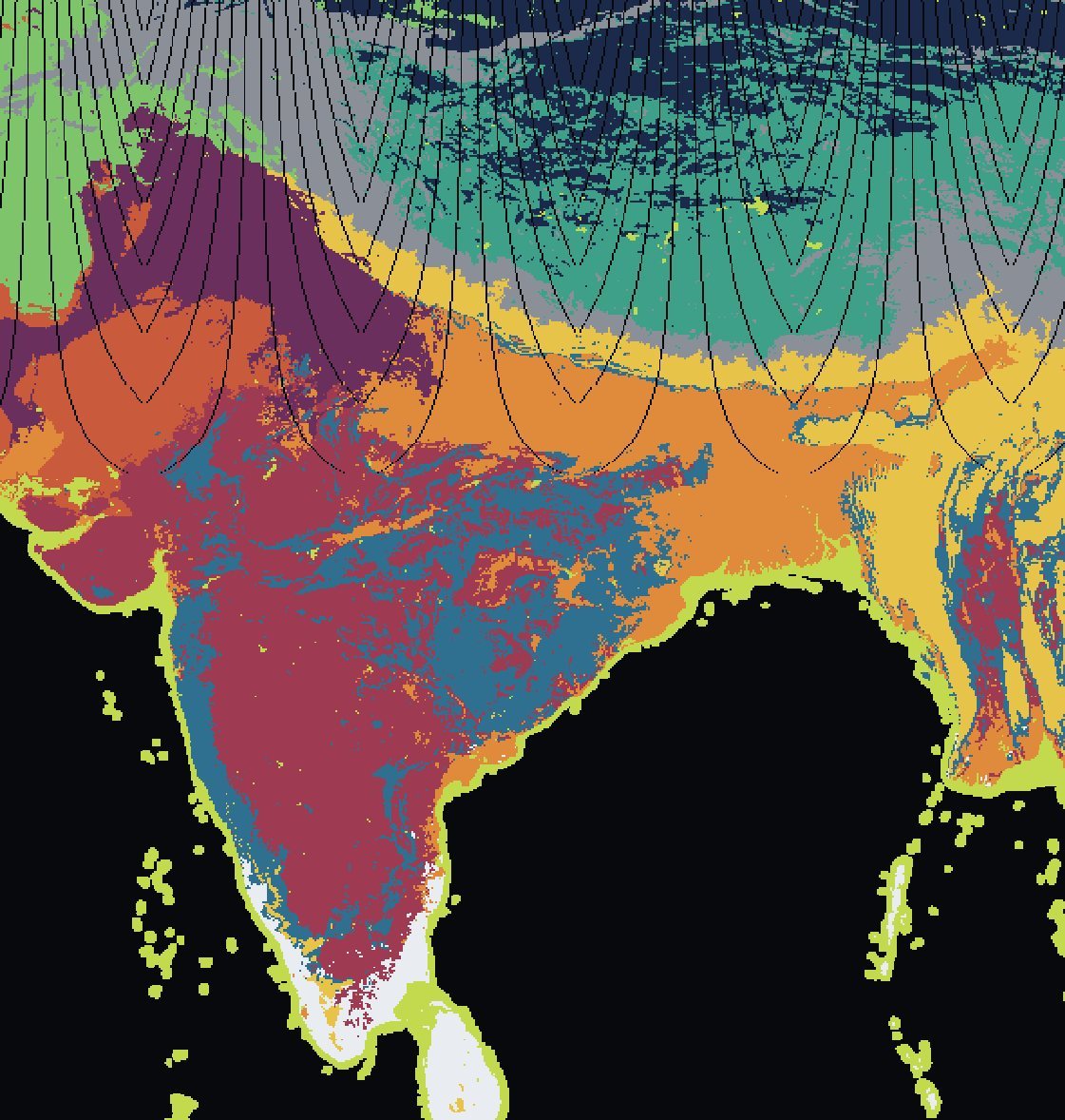
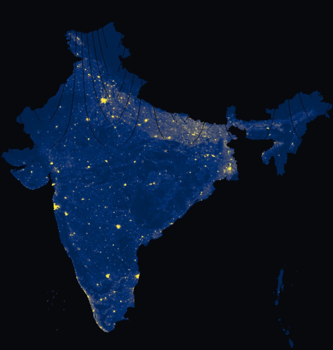
Every layer below is drawn from the same 318,706 cells. Switch between them: the country is the same, only the question changes:
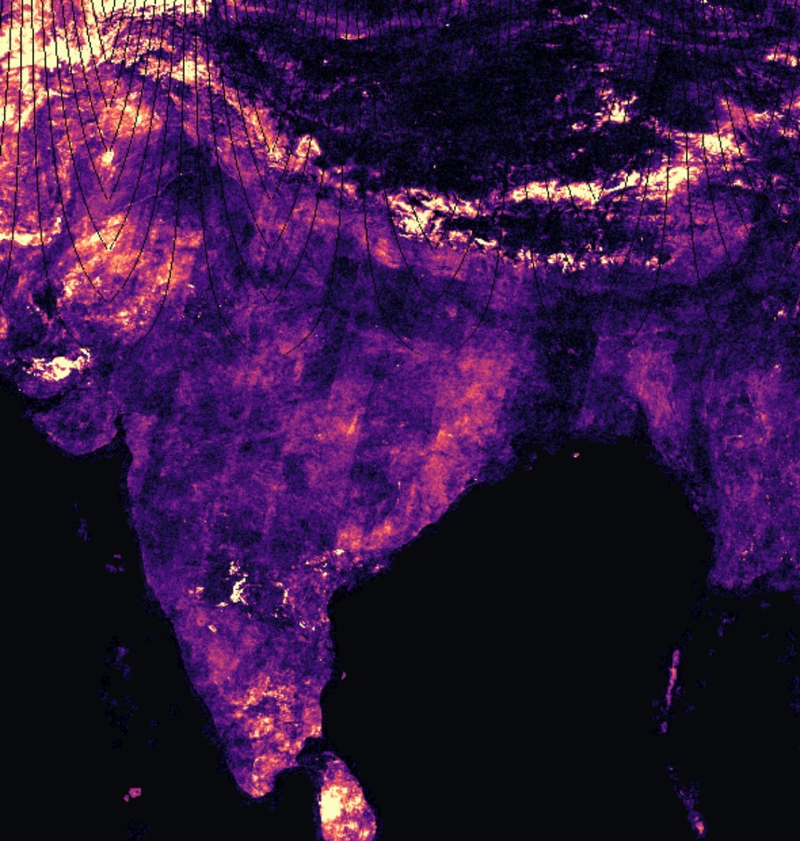
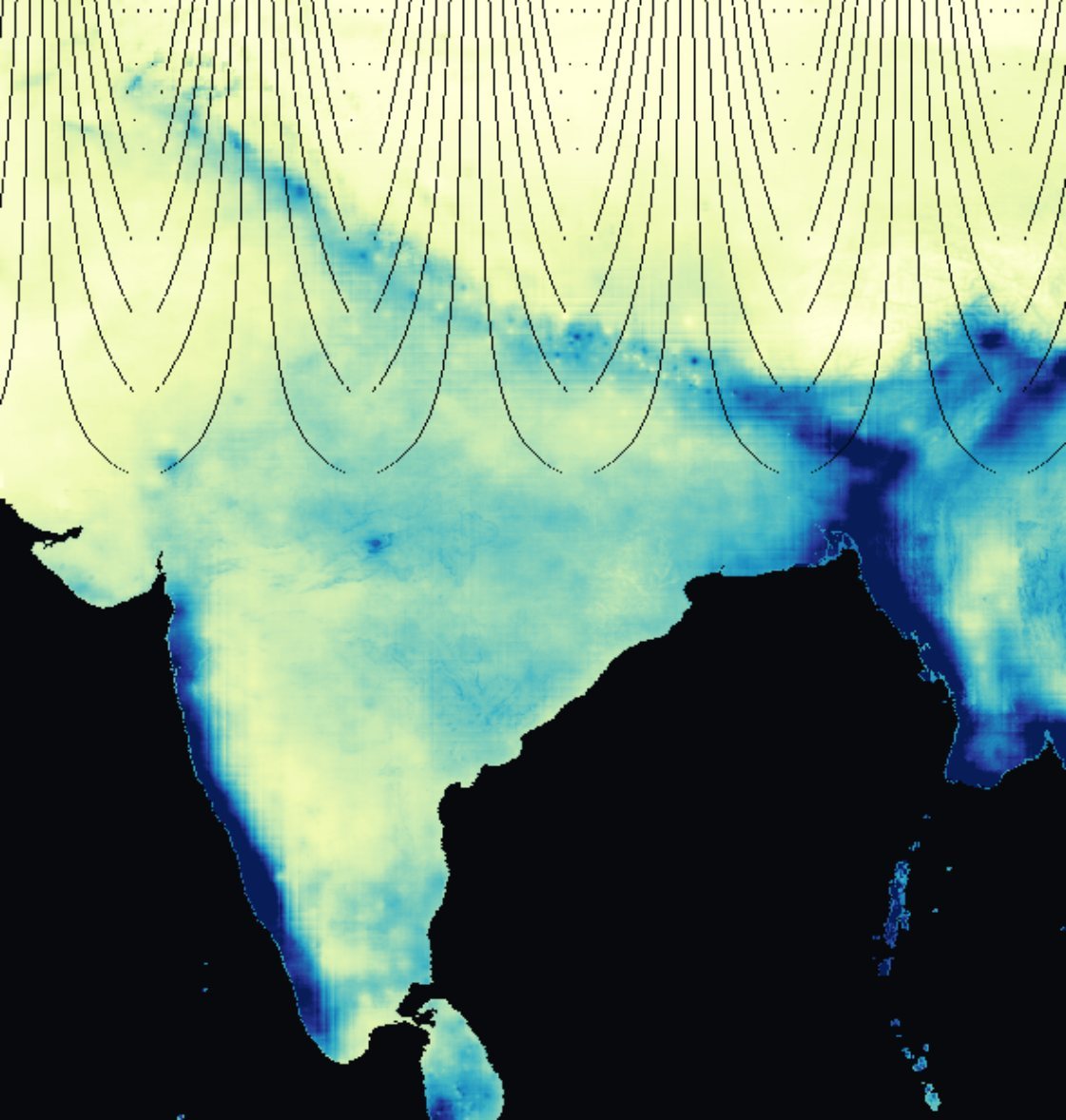
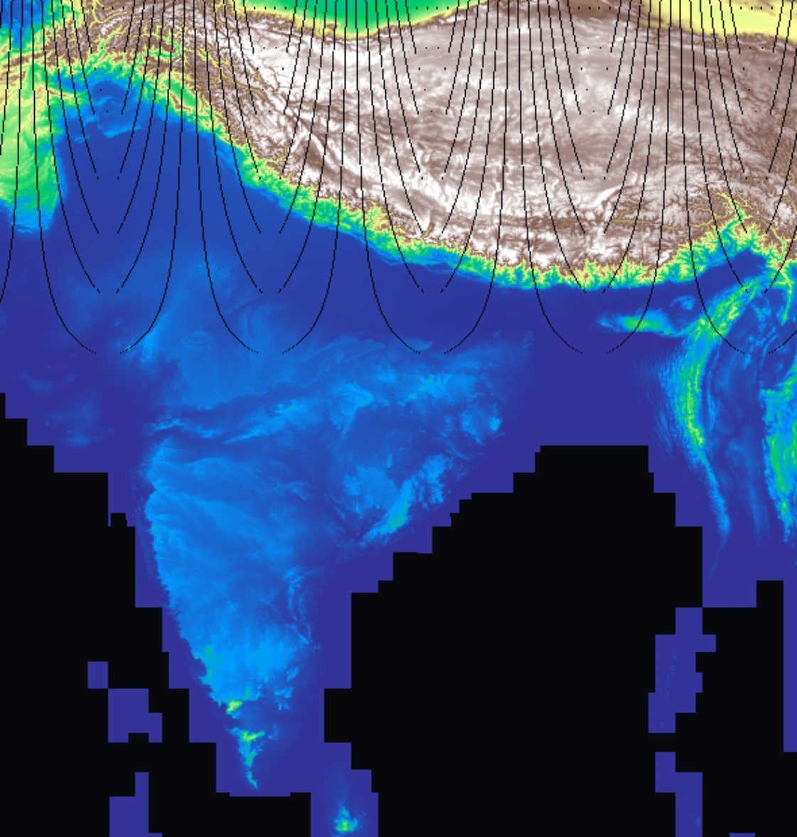
Cosine distance between each cell’s fingerprint this year and last. Bright means the surface changed. This is the layer we built the whole instrument to produce, and the one the referee later showed measures volatility rather than development.
The faint curved seams across the north are a known-open bug in the UTM zone joins. They are disclosed in the data dictionary and left visible here rather than retouched out.
A second domain, the same night
Three hours after the first grid finished, we pointed the same method at something with nothing in common with satellites: NASA’s battery ageing corpus. Thirty-six gigabytes from public storage, not the convenient mirror, which silently drops the impedance cycles. A MATLAB struct-array became five normalised tables and 7.28 million rows, and the data dictionary was written before any analysis ran.
A research OS that only works on one dataset is a project. Proving it on an alien domain is what makes it an OS.
Four connectors, two bugs
Population, elevation, districts and built-up area were joined onto the grid. Two bugs came out of it, and both are the dangerous kind, because both produce numbers that look entirely reasonable.
A negative window offset shifted the whole population raster by 239 rows. Delhi came back at 263 people per square kilometre instead of 23,452, wrong by two orders of magnitude, and still a number you could put in a table without anyone blinking.
Summing counts over overlapping sample boxes gave India 1.75 billion people instead of 1.34 billion. Correct arithmetic on a wrong assumption: with overlapping windows you must take the mean, not the sum.
The population layer in the switcher above is the plate that came back with Delhi at 263 people per square kilometre the first time, and it looked fine. Nothing about a shifted raster announces itself; only the census cross-check caught it.
The bugs that matter do not crash. They return a plausible number, and the only defence is an external cross-check: total land area against the published figure, total population against the census.
The dashboard, and its danger
A hundred and thirty-two megabytes of binary layers, twelve views, a year slider with playback. It is the prettiest thing in the project and the least load-bearing. It looks like an answer.
The Land types view in the switcher above does the most damage: it is beautiful, it is obviously structured, and structure is exactly what a person goes looking for. Six weeks later the referee showed that the layer underneath it cannot detect the thing we built it to detect.
A dashboard is a claim with the evidence removed. Everything on this one was true and none of it had been tested, and for a month nobody noticed the difference, including us.
The referee night
A month after the instrument was finished, we turned it on our own results. Three hypotheses, three kills, each one chained to the last.
Rainfall drives land-surface change. Dead: a calendar artifact. A national year effect swings mean drift by 2.3×, and the two dry years happen to be the two lowest-drift years.
Fine, but the swing itself is real. Dead: the ordering is inverted. Water drifts 2.11× and desert 1.88× against cropland, while built-up land drifts 0.74×. Construction makes land stiller.
Fine, but it still detects real change. Dead: matched against an independent forest-loss dataset, the detector scores an AUC of 0.486. That is worse than a coin.
Each kill was the referee check on the previous one. Three rounds of “fine, but” is what an honest retreat looks like written down.
Five pre-registered questions
Predictions written in code before the test ran. Two killed, two partial, one answered.
The humiliating one: a baseline of “where it grew before, it grows again” predicts construction at an AUC of 0.977. The satellite embedding manages 0.60. A single lag of the target beats the entire sixty-four-dimensional apparatus by a distance.
A trivial baseline is not a formality. Run it first, or you will spend a month measuring something a single lagged variable already knew.
What survived
Rainfall volatility moves the land surface at a rank correlation of 0.357 against a null of 0.000. Rainfall level does not. Those are different claims and only one of them holds.
India’s built-up growth is a fringe phenomenon: 74.6% of 2015–20 growth landed on cells that were already between 0.5% and 5% built, up from 60.2% in the 1990s. It is the one clean positive result in the project, and it uses no embeddings at all.
Press play. Thirty-five years of building, on one fixed colour scale so the growth is real rather than a rescaling artifact:





 1990
1990Built-up fraction, 1990 to 2025. Watch the corridors thicken between the cities rather than the city centres themselves getting brighter: that is the fringe result, visible without a single statistic.
The reframe worth the month: the instrument measures surface volatility, not development. That is a real thing to have built. It is simply not the thing we set out to build, and saying so is cheaper than defending it.